Case Study
Domli is a UK-based designer and online retailer of sustainably sourced solid-wood furniture and home essentials. Focused on craftsmanship, fast delivery, and sustainable materials, Domli has fast become a trusted name for those seeking timeless furniture built to last. After launching Domli’s new Shopify website, we continued as their dedicated growth partner, building, scaling, and optimising performance marketing through Google Ads. Campaigns were strategically structured across Performance Max, Shopping, and keyword clusters, with ongoing A/B testing to refine spend efficiency and maximise return. Our team added creative and strategic horsepower with high-performing copy, design, and video ads, ensuring every touchpoint communicated the brand’s sustainable story while driving measurable conversion growth. Through continual testing, and optimisation, Domli’s paid search performance continues to strengthen month over month, supported by Kubix’s proactive, data-driven partnership.

.png)
You never forget your first home. Whether it’s the freedom to express yourself on any and every wall, or the feeling of ending the day in a place that feels your own, finding somewhere that your heart feels at home is a core moment on every journey through life. In the retail world, the same can be said for any new start-up that is just finding their way onto the market, whether virtual or physical.
This was the case for ethical home brand domli in 2022 when they approached us in need of their first online store. With a mission to provide customers with quality, natural products and a hassle-free shopping experience, they specialise in beautiful, sustainably sourced wooden products - from solid oak chopping boards to floating shelves and custom desks. The founders of domli already have a background in retailing multibrand homewares, and this new venture is their opportunity to explore and dominate the market for themselves. With beautiful wooden homewares that were ethically sourced from around the globe, domli came to us yet to create an online presence for themselves. They were at the very start of their journey and a Shopify store was the next big step. Kubix was ready to take them there.
The very first move was to establish exactly what the domli team wanted their virtual home to look like. Armed with a logo, clear photography style and a collection of HEX colour codes, domli provided our design team with exactly what was needed to get started on their moodboard. The focus wasn’t solely on the look of the website though - just as UX is always a priority for our team, this was especially important for domli too.
Our design team was keen to introduce elements to the site that would pull from the playful, soft domli logo. These included rounded corners on borders and buttons that would mirror its curvature and fun, illustrated icons that take inspiration from the domli heart. Big text blocks and images with high quality lifestyle photography paved the way for a product focus throughout the site. The results? A bright, bold and clean design that let domli’s products shine, with pops of personality added in through copy, icons and their slogan, “Home is where the heart is” given pride of place on the homepage.

"Excellent communication throughout the process. Quality of work from design, development to deployment has been very good. Also on hand to resolve unforeseen problems post launch. Thank you Joe, Elodie, Jess, Sharon, Ryan and the wider team!" - Will, domli Founder
The very first move was to establish exactly what the domli team wanted their virtual home to look like. Armed with a logo, clear photography style and a collection of HEX colour codes, domli provided our design team with exactly what was needed to get started on their moodboard. The focus wasn’t solely on the look of the website though - just as UX is always a priority for our team, this was especially important for domli too.
Our design team was keen to introduce elements to the site that would pull from the playful, soft domli logo. These included rounded corners on borders and buttons that would mirror its curvature and fun, illustrated icons that take inspiration from the domli heart. Big text blocks and images with high quality lifestyle photography paved the way for a product focus throughout the site. The results? A bright, bold and clean design that let domli’s products shine, with pops of personality added in through copy, icons and their slogan, “Home is where the heart is” given pride of place on the homepage.

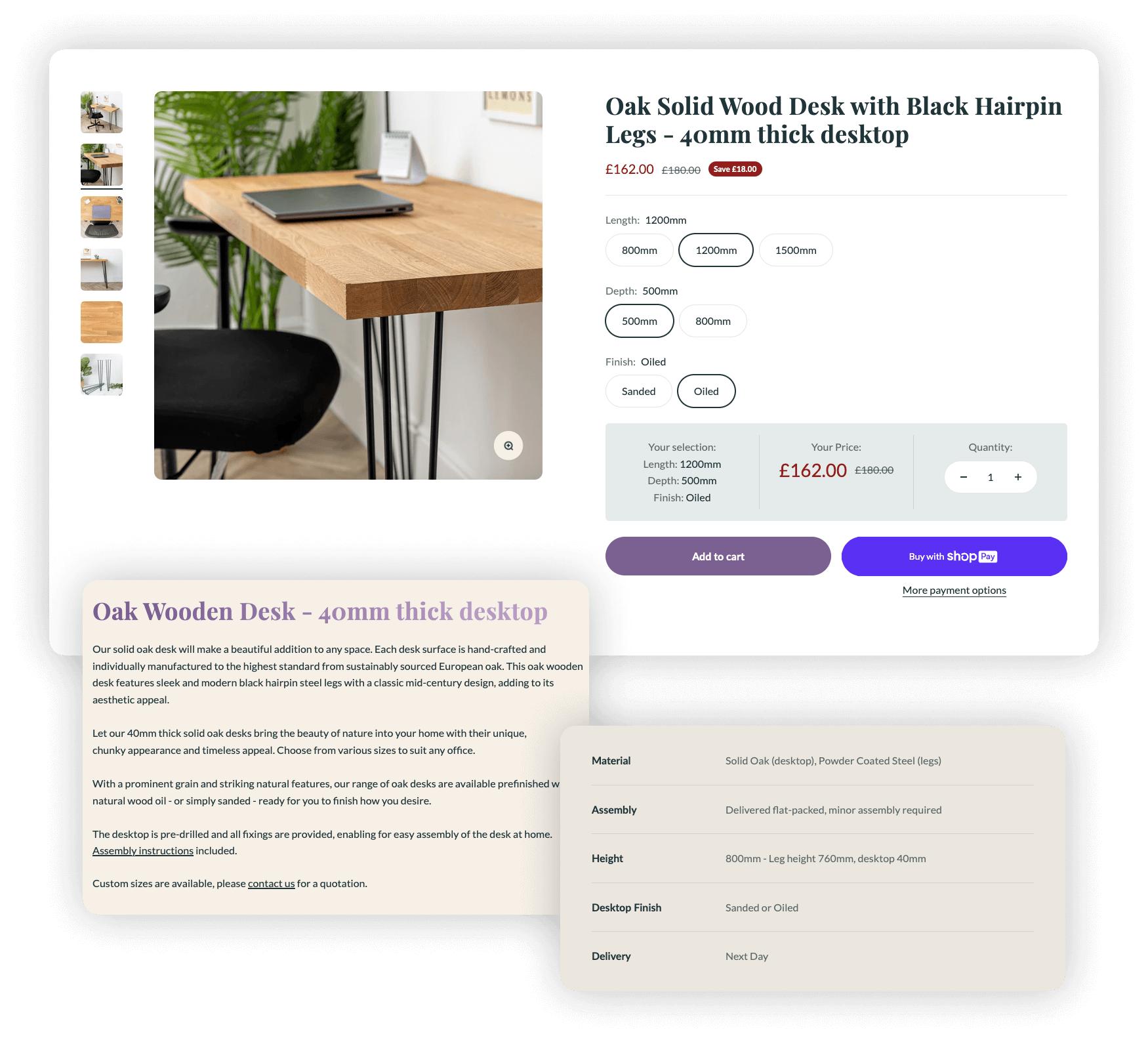
A product page’s most important job is to showcase an item in all its glory, giving potential customers everything they need to know exactly what they’re about to spend their hard earned cash on. The nature of domli's wooden products meant that they required lots of variants - from different lengths, depths and finishes - all of which had to be displayed on the product page without it feeling cluttered. This is exactly what our design and development experts were able to produce for domli. Clear variant buttons are simple to select, and a summary section is featured detailing a customer’s chosen product dimensions along with the price. Displayed just above the add-to-cart buttons, these features avoid any possible confusion for potential buyers.
But that is just the beginning of where this product page shines, and there are more features to be found that have left our design team particularly proud of this corner of domli’s Shopify store. Whether it’s the engaging and detailed descriptions that give customers a real feel of what they are going to be buying, or the table of specifications that hones in on the finer details of each piece - domli are able to provide all the information a potential buyer might need to really get to know exactly what they are looking at.
Whether it’s the domli heart you can find hiding in the background on the homepage, or the pops of cheeky copy that give the site a fun and personal touch, there are many elements to admire within this Shopify build. Right from the get-go, the domli team were fully involved in the process and, thanks to clear communication and understanding of the future of their brand, we were able to deliver their expectations and then some. Talking them through the journey every step of the way helped them to understand every process involved in building their Shopify store so that they could be confident and comfortable with the finished results.
And it’s safe to say that the results speak for themselves. The sales started rolling in for domli as soon as their new site went live, and they show no signs of slowing down.
Now? The Kubix-domli relationship continues to grow as they step on board for marketing. We are excited to see the results that our paid media team can achieve for this exciting home brand and, if their new site is anything to go by, they have a bright and beautiful future ahead of them.

Our team have built over 300 Shopify stores.
Get in touch with us today.