Case Study
Striking it rich with our latest health drink project.
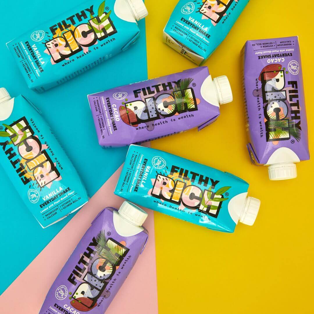

.png)
Raising pulses. Climbing hills. Riding waves. These are just some of the small ways in which the gang over at Filthy Rich recommend living life to the fullest. And given the past 18 months which saw many of us confined to our homes for so long, we couldn’t agree more.
With fitness and mental wellbeing so high on people’s priority lists, Irish entrepreneur Conor put his enthusiasm for health and wellness to good use and developed a brand new health drink. Enter Filthy Rich, stage right. This quirky brand burst onto the scene with their range of shakes and a plan to expand to other health drinks and snacks in the near future. Their shakes are packed with vitamins, minerals and plant protein - making them dairy free, gluten free and vegan to boot. Currently with two flavours to choose from - vanilla and cacao - or a Get Rich Quick kit for those who can’t choose, Conor spent a long time developing a winning formula that would taste delicious whilst also giving you a much-needed boost for the day ahead. Not just for the masculine, protein-packed powerlifters, Filthy Rich is for anyone who wants a healthy vegan drink on the go.
But when did we first hear about them? Conor and his team originally approached Kubix with a challenge to completely redesign their website. The site was still in development at the time with a different team, and they weren’t happy with the designs they’d been shown. Our Kubix challenge was primarily a visual one - to bring out the colourful, vibrant branding and show the health shakes off to their maximum potential. With the Filthy Rich crew already having hired a content writer to populate the site with quirky, inspirational copy, our Comms team sat back and let the designers get to work.
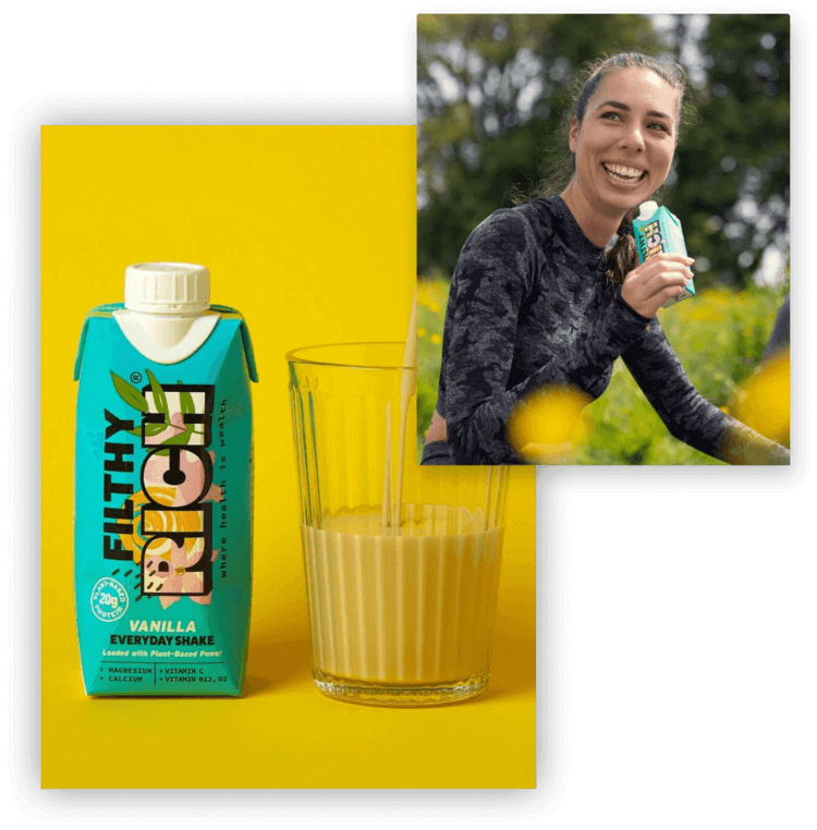
Designing a super colourful site is always a fun challenge for our team, and our creatives relished the chance to step away from monochrome, muted palettes in favour of something vibrant and fun. They used the ingredients found in each of the shakes as inspiration for their design, adding ‘floating’ coconuts and sugar peas throughout the site to break up the colour scheme. In order to differentiate between the two main flavours, our design team also decided to match the colour of each product page to the product packaging - the iconic blue for the vanilla shakes, and the rich purple for the cacao. And in future? The more Conor expands the Filthy Rich range, the more colourful the site will be.
Once the Filthy Rich team was happy with the look of the new site, it was time to bring it to life with animated icons and stylised section dividers that undulated across the screen in line with our team's Design processes. Whilst Conor’s initial preference had been for more animations than less, we settled on a mixture of moving and static icons to avoid the pages looking too busy. These animations can be found across the homepage, product and collection pages to add a little bit of character to the user journey.
Finally? Our next task was to reflect these new designs across all of the brand’s email marketing. We built custom email automations to fire out as soon as a customer subscribes, ensuring a cohesive journey from the site right into their inboxes.

“It was a pleasure for us to partner with the Kubix team for this project. As a business just starting out they understood exactly what we were trying to achieve and provided us with invaluable guidance, advice and creative input.” - Conor, Founder
Designing a super colourful site is always a fun challenge for our team, and our creatives relished the chance to step away from monochrome, muted palettes in favour of something vibrant and fun. They used the ingredients found in each of the shakes as inspiration for their design, adding ‘floating’ coconuts and sugar peas throughout the site to break up the colour scheme. In order to differentiate between the two main flavours, our design team also decided to match the colour of each product page to the product packaging - the iconic blue for the vanilla shakes, and the rich purple for the cacao. And in future? The more Conor expands the Filthy Rich range, the more colourful the site will be.
Once the Filthy Rich team was happy with the look of the new site, it was time to bring it to life with animated icons and stylised section dividers that undulated across the screen in line with our team's Design processes. Whilst Conor’s initial preference had been for more animations than less, we settled on a mixture of moving and static icons to avoid the pages looking too busy. These animations can be found across the homepage, product and collection pages to add a little bit of character to the user journey.
Finally? Our next task was to reflect these new designs across all of the brand’s email marketing. We built custom email automations to fire out as soon as a customer subscribes, ensuring a cohesive journey from the site right into their inboxes.

When it was time to set the new site live, the Filthy Rich team spoke with our Operations team on how they could fulfil their stock as easily as possible. We integrated a fulfilment system called ShipHero which would connect their site orders and fulfil stock automatically, leaving Conor and the team to focus on the bigger picture: developing the next generation of Filthy Rich drinks.
Despite our team originally only coming in to help with the site designs, it was great to continue working with the Filthy Rich team on their email marketing and fulfilment needs. If you'd like to discover how YOU could shake up your systems and processes, then don't hesitate to get in touch.
As Filthy Rich's brand story states, there’s never been a better time to put health first. And with everyone enjoying life post-pandemic, this brand is definitely changing the game: one sip at a time.

Our team have built over 300 Shopify stores.
Get in touch with us today.