The world today is full of stimuli that get people's attention. Therefore, brands have to surprise and delight their consumers by mixing up colours, fonts, images and content. They need to be creative and think outside the box to catch visitors by surprise and keep them interested in their website. People are designed to crave the unexpected. The more you can surprise them, the more you’ll keep them engaged on your website.
The concept of ‘surprise and delight’ doesn’t have to be complicated or expensive. The unexpectedness can come from a creative marketing strategy translated into copy and graphics. Find below five creative Shopify stores that will delightfully surprise you.
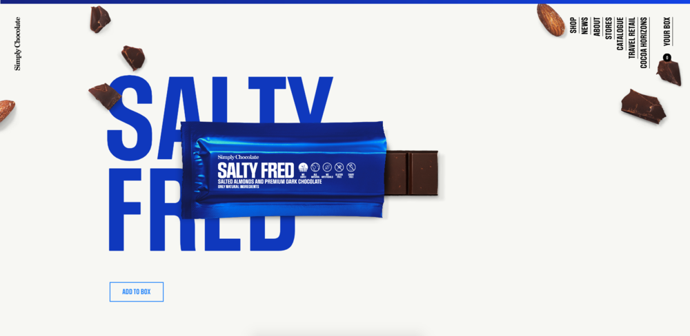
Simply Chocolate. 🍫
For the true chocolate lovers, opening a chocolate bar is a ritual as important as the tasting time. The design of this confectionary e-commerce store breaks the usuals design rules while remaining user-friendly. Once you are comfortable with the vertically aligned navigation, you’ll be amazed by the website interactivity.
Simply Chocolate gives you the experience of unwrapping the product by following a circled arrow. Scroll down and you’ll see the whole bar floating up in the middle of the page. Scroll again, and the chocolate bar will break and rise up the screen to you, so you can “bite into it”. How could you possibly resist?
The product page is very unconventional but undoubtedly more powerful than the classic left image and right description layout seen on so many websites. There is no need for plenty of product images when you can just unwrap and break the chocolate bar yourself.
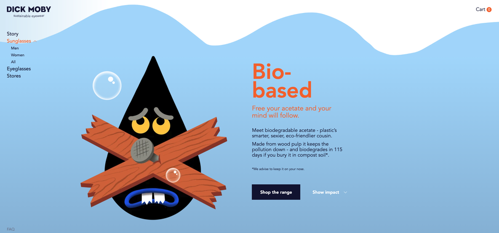
Dick Moby. 🕶
Dick Moby is an Amsterdam eyewear brand that sells sustainable glasses. Named after the book Moby Dick which tells the story about a whale fighting back against humanity, the purpose of the brand is to create awareness of our impact on nature. The glasses they sell are made from biodegradable and recycled materials, making their brand one of the pioneers in eco-eyewear.
Instead of trying to get the user to click on a specific collection or product page, Dick Moby starts by explaining the “Why” of the brand. Explaining the purpose and the reason why the brand exists is a great way to inspire people to take action. Communicating the passion behind the brand triggers positive feelings like trust and loyalty, and encourages the purchase decision.
The best part about the Dick Moby website? They're not afraid of light-hearted, humorous content. Climate crisis banners can be quite overwhelming and terrifying, but Dick Moby managed to reduce the anxiety by using a funny tone of voice with some playful illustrations. The story is told in a way that is easy and enjoyable to follow. As visitors scroll down the page details are revealed, explaining piece-by-piece how the brand is engaged to bring a sustainable style to eyewear.
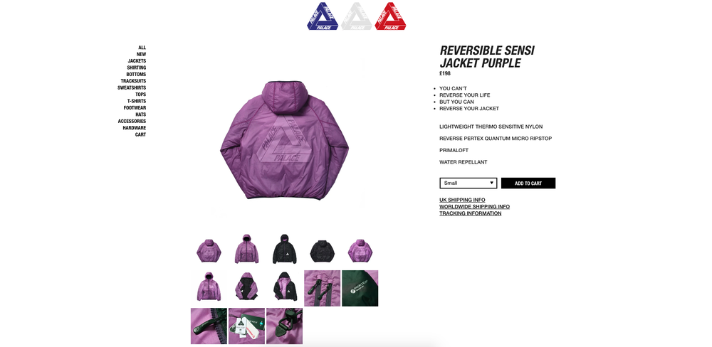
Palace Skateboards. 🛹
Palace Skateboards is a skateboard and clothing shop based in London. The brand, founded in 2009, had no previous business experience but today their collections sell out in minutes. The secret? A unique, brash and nonconformist tone of voice!
The Palace Skateboards web design is beautifully simple: a white background, logo, navigation and products. But where the brand truly delights its customers is with their product descriptions. Each one is hilarious and well worth a read. The copy is completely irrelevant, but you could sit and read the product descriptions all day long. The brand uses the traditional bullet-point format, to make up a sentence or a train of thoughts when they are all put together. For example, “Let me know; How many beers; you can fit; in this jacket; I have 9 in mine so far!” is the description of the Bare Storage Jacket Stone.
Using the same formula would probably spell disaster for any other shop, but this shows how an unexpected copy can be used to differentiate a brand or make it memorable. This is a great example of knowing your audience enough to break the rules.
Miilk. 👶
Founded by two Australian mums who both found it difficult to source thoughtful and practical clothing for their young babies, Miilk is built around the concept of buying less but ensuring their products will be well lived-in, worn and adored. The clothes are designed for everyday living and playing while keeping comfort, style, and practicality in mind.
The layout is minimalist and very unusual. It is very rare to see a logo being vertically positioned on the bottom left. The navigation is displayed in the middle of the page on the homepage to leave room to display two large photos of a cute toddler wearing the product. The stunning photographs set the feeling for how the rest of the website design will be. The message “We make millk for your baby”, associated with a blond toddler dressed in a milky white onesie is efficient, simple and catchy. We naturally associate the words “milk” with “baby” as the most natural combination. The brand plays with that association to appear as the natural clothing choice for your baby.
The collection pages don’t have the titles, description and filters recommended by every UX eCommerce expert, but they are telling a story and engaging the customer. The product images on these pages display the clothes thrown carelessly on a light surface, slightly wrinkled, as if they had just come out of the wardrobe. We easily imagine a hard-working mum picking an outfit out for her baby. And every now and then, some product images show the toddler comfortably playing in the clothes, to remind us how comfortable and practical they are. This store shows that a lifestyle photography teamed with a good story is a fantastic tactic for drawing people in.

Oi Polloi. 👖
Oi Polloi is an independent boutique from Manchester that has been shaping men's wardrobes since 2002.
The website design of this e-commerce store is very unusual. The navigation is displayed above the logo and an announcement bar replaces the classic cart icon. Although at first, it seems fragmented, this layout is based on a mobile-first strategy. The three navigation buttons on the top look the same on every device. The big images on the product pages look perfect on mobile. The basket announcement bar is visible from everywhere, making the checkout journey easier.
The multiple colours and fonts across the Oi Polloi site create a unique experience. The background colour changes whether you are on the homepage, the product page or the blog section. The colour scheme breaks away from the overused black and white style used by some big brands and engages users for a much longer time.
The site grabs his customers' attention with doodles and handwritten-looking text scrawled across images and images of people posing in a grungy style.
Surprise and delight are the key ingredients to bring a flat or dull website to life. It can make a big impact on your design and the overall user experience of your site. If you are not comfortable with breaking the rules (which exists for a good reason), consider starting small by playing with the titles and headlines copy or replacing the boring icons. By making these small improvements, you’re not only infusing your design with personality, but you are also increasing your conversion rate. The ultimate way to make your brand pop.
Looking to bring out the best in your brand? It all starts with a breath-taking website.
We can bring your vision to life.
Our team are ready. Get in touch today.