Getting new customers to your online store is simple enough. But keeping them there? That’s where the real work begins. In today’s fast-paced consumer culture, the conversion rate of your store all depends on your customer’s journey from cart to checkout. If you have any stumbling blocks along the way, potential buyers can quickly turn away and shop elsewhere. So what can be done to your store to ensure that those customers stay and, more importantly, convert? Keep reading for nine easy ways to improve your online’s store’s conversion rate.
1. Avoid Decision Paralysis
A surefire way to overwhelm consumers and cause conversion rates to plummet? Give your buyers too much choice. Often seen as a positive USP, customers may think that plenty of choice is what they want. But a delay in decision-making may cause users to give up or go away to think about it, significantly reducing the number of customers who eventually make a purchase. If you can, limit and simplify the choices that are available to your customers. Offer those popular blue suede shoes in just one or two shades of blue instead of twenty - just the one option will give you a higher chance of conversion if your customers like what they see.
.jpg)
2. Simplify Your Search
The navigation of your online store needs to work in a simple, coherent way. Make sure your menu emphasises what is most important, avoiding unnecessary links to pages that aren’t key to driving sales. Are your products sorted into orderly collections and divided up clearly into specific and relevant categories? This all contributes towards a fast and frictionless process - especially if you have a large product offering. If a potential buyer has to spend time seeking out what they’re looking for, the chances of them giving up and going elsewhere are high. Take this one step further by including a search bar on your site (and make it easy to find!).
3. Optimise Page Loading Times
If your site is poorly optimised and loads slowly, you’ll be testing the patience of your visitors. With ever faster devices, consumers expect things almost instantly, and anything short of speedy will put them off. In fact, research suggests that a load time of 1 to 3 seconds increases bounce rate (people who visit one page and leave) by 32%, while a load time of up to 10 seconds increases bounce rate by an eye watering 123%. Not exactly conducive to record-breaking sales.
Optimise your page load times by keeping data heavy content to a minimum. Ensure your images aren’t unnecessarily large, and upload only at a sufficient resolution to make them display correctly. Reduce products to a minimum on individual collections pages so visitor’s browsers aren’t burdened by having to load too many products on one page at once. Make sure there aren’t too many unnecessary plugins or apps injecting complicated code into pages, causing errors or conflicts with other page elements.
4. Clarify Your Copy
Copy should be creative and well suited to your tone of voice, but don’t waffle or pontificate about your products; too much text on a page could easily cause visitors to become bored and frustrated when they really just want you to get to the point. It’s also important to ensure your CTAs, buttons and links are clear and specific, making the choices available to your customers distinct. Clearly distinguish your Buy Now button from your Add to Cart, and don’t confuse potential buyers with wording that could be misinterpreted.

5. Streamline Your Checkout
Your checkout is one of the most vital areas that can make or break a sale. Whether it’s unexpected delivery costs, too much unnecessary information or no ability to checkout as a guest, this is where you need to keep things simple, get rid of junk and cut out clutter. 23% of users will abandon their basket at the checkout if they have to create a user account in order to purchase. By allowing for guest ordering, you put the power back in their hands, and you are much more likely to make the sale.
6. Drive Away Doubt
Welcome offers or loyalty schemes are an excellent way to draw people in and keep customers coming back time and again. Think beyond the discounts to your other USPs. Free shipping and/or free returns is a great way to remove any barriers to purchase, as customers know that they have nothing to risk in shopping with you. A returns policy will give your potential buyers confidence - just make it easy to find, from the product page right through to the checkout. By creating assurance everywhere your customers look, you’re offering an effortless process that could prevent them from overthinking their decision.
7. Consider Your Shipping Rates
Speaking of delivery - same-day delivery options or free delivery over a certain amount instantly makes your products more accessible through saving time and money. With these kinds of services now the norm, one thing is for sure: if your delivery is expensive and slow, visitors may be put off from making a purchase, and look elsewhere for a store that does offer fast and free delivery. Consider how you can incorporate reduced shipping time and rates into your strategy, even if it means raising the prices of your products.

8. Show Social Proof
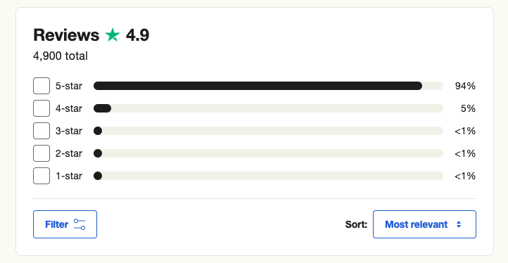
Whilst nothing beats e-commerce for ease and speed, it does mean that your customers won't touch and feel your items until they arrive at their front door. So how do you build trust with your audience before they part with their hard-earned cash? Reviews, testimonials and social proof all go a long way in encouraging fellow buyers to check out. A staggering 92% of consumers will hesitate to buy a product if there are no reviews left by customers. Clothing stores such as ASOS not only include quality photography and videos showing off the garment from every possible angle, but they also include customer reviews right there on the product page. Any new fashion lover can easily see what others are saying about the fit, quality and their overall happiness with the product, often leading to them becoming a buyer too.
9. Made for Mobile
46% of adults prefer to use their mobile devices to search for items before purchasing them over their desktops or laptops. This is why it's vitally important that you give priority to your mobile view over desktop.
Check your banners, from the header to promotional blocks and make sure that all of your text is legible. Ensure your buttons show up clearly and that pop-ups don’t get in the way of important information or links. With an effortless shopping experience at their fingertips, the probability of consumers actually buying from your store (and coming back to do it again) will be greatly increased.
-
It’s never been more important to have an online business that converts. Optimising your conversion rate is vitally important if you want to make more sales and retain customers for the future. If you want to learn about Conversion Rate Optimisation (CRO) in more detail, and the strategies, tools and techniques that can help you with yours, we’ve taken a deeper look here.
And if you’re looking for an agency who can take you to new heights by streamlining your online store to increase sales, get in touch with our Kubix team today!


